Jenifer Smith Architects
Graphic design for one of Trinidad & Tobago’s leading architectural practices.
When a friend becomes a client, things can go in a few different directions. Thankfully, this project represents one of the best!
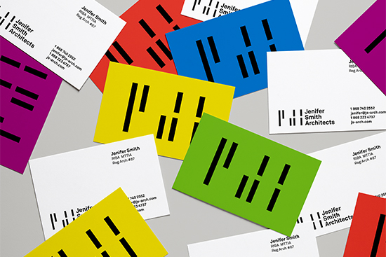
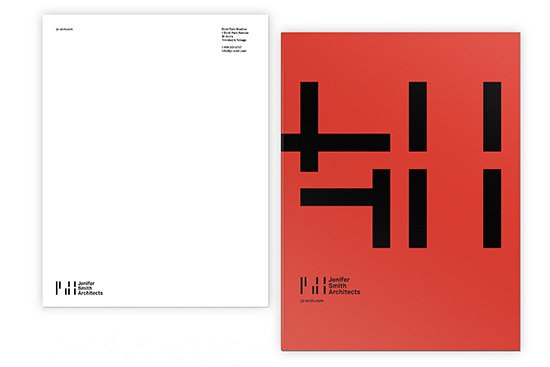
I’d gotten to know and admire Jenifer’s work before we met, almost a decade ago. So, in mid 2016, when she asked me to update her firm’s identity, I was thrilled. Jenifer is a top-notch architect – one with a progressive yet direct approach to her projects. We chatted about what she was looking for, and I went through numerous drawings and photos of her buildings. What struck me was how she plays with space, particularly transitions. From there, a very simple mark developed – one that abstracted a geometric J, S, and A into bars reminiscent of the corridors/transitional spaces in many of Jenifer’s works. I tried to keep things as elegant and clean as her buildings.
A Swiss typeface was selected, and black (bold, strong) specified for her logo. The bars of the mark reminded Jenifer of the Cuisenaire rods that she used to play with in her childhood; they became my guide in developing a secondary palette of five colours, to be used mainly as backgrounds or accents. For the duration of the project, Jenifer was entirely on board and trusting – one of the best clients I’ve ever had. Her identity leaves room for expansion and play in terms of rollout of future items, and we find that pretty exciting. We’ll see what’s next!
SUMMARY | Role: Graphic Designer
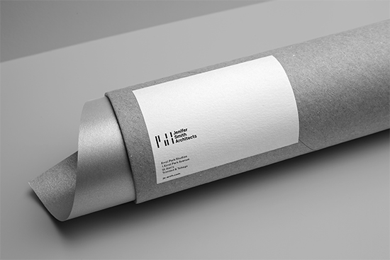
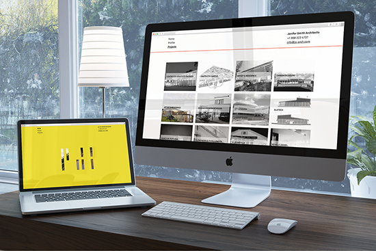
Includes: Logo, business card, letterhead, labels, signage. Creative direction of website, which is currently being built by Agyei Archer.

